I have to apologize. I haven’t been fully throwing myself into this blog. Building a house is a lot. I knew that going in, so this is absolutely not a pity party for one. I’m just sort of giving myself public permission to feel a little overwhelmed by Doing All the Things.
I write all day for work, so my creativity is often tapped by the time I want to blog. I’m trying to stay on top of what feels like 6,742 things for the build. I’m also trying desperately to keep up with my regular responsibilities (groceries, cooking, the dogs, cleaning, etc., etc., etc.). When I sit down to write a post it’s usually A) weeks after The Thing in the Post has been done, and B) just whatever quick rundown I can hammer out before hitting publish.
All that to say… IT’S OFFICIALLY OPINION O’CLOCK, BABY! Time to finally put a little hyperbole into the House of Hypberbole.
Understatement of the year: I have not taken building our dream home lightly. I’ve been reading endless blogs and articles for literal years. I follow a ton of “influencers” on various socials. I’ve been a stiff, crunchy sponge desperate to soak up any and all ideas. As I absorbed this flood of content, one thing really started to stick out to me: These people are afraid of color. Like, terrified-bordering-on-phobic levels of afraid.
So they’re building these multimillion-dollar McMansions and making every room ivory or taupe—walls, flooring, trim, cabinetry, furniture, window coverings… And then they have the audacity to put a dusty rose pillow on the couch and squeal, “I just LOVE how this pop of color brings the whole room together.” I have bad news for you, Brantleigh, a solitary pink throw pillow is not enough to infuse personality into the 500-square-foot, oatmeal-colored void you’re calling a great room.
Maybe everyone was planning for an eventual resale, I don’t know, but I can’t imagine LIVING in a house that’s 50 Shades of Beige just so it’ll be more appealing to strangers later. Fortunately, we’ll be in this house until we retire so we can do whatever the hell we want with total disregard for the next owners. Anyway…
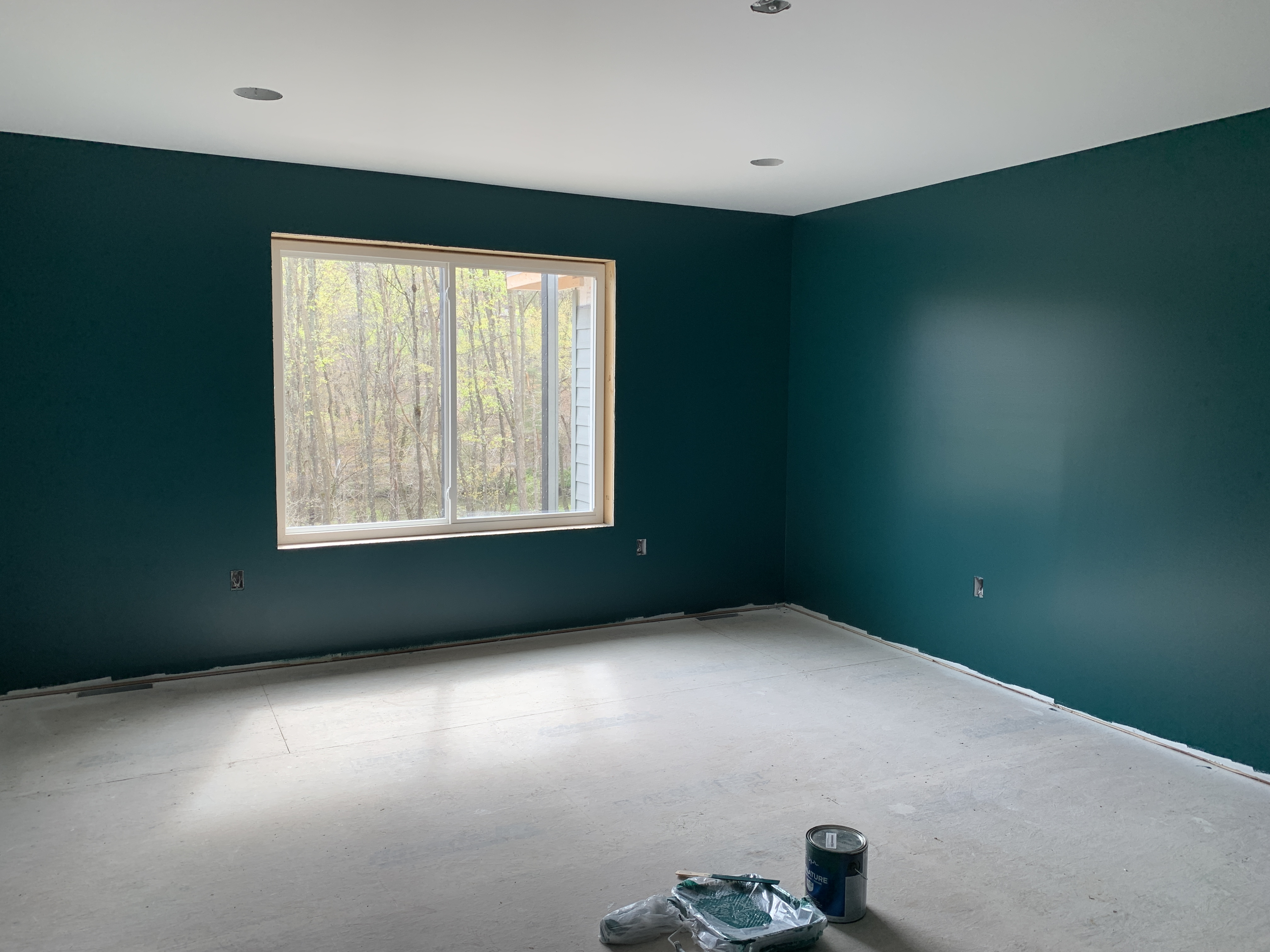
In a move that will surprise absolutely no one, I was intensely drawn to something that feels teal. It’s slightly greener in person and when we add the dark oaky flooring, it’s going to feel like a forest oasis.
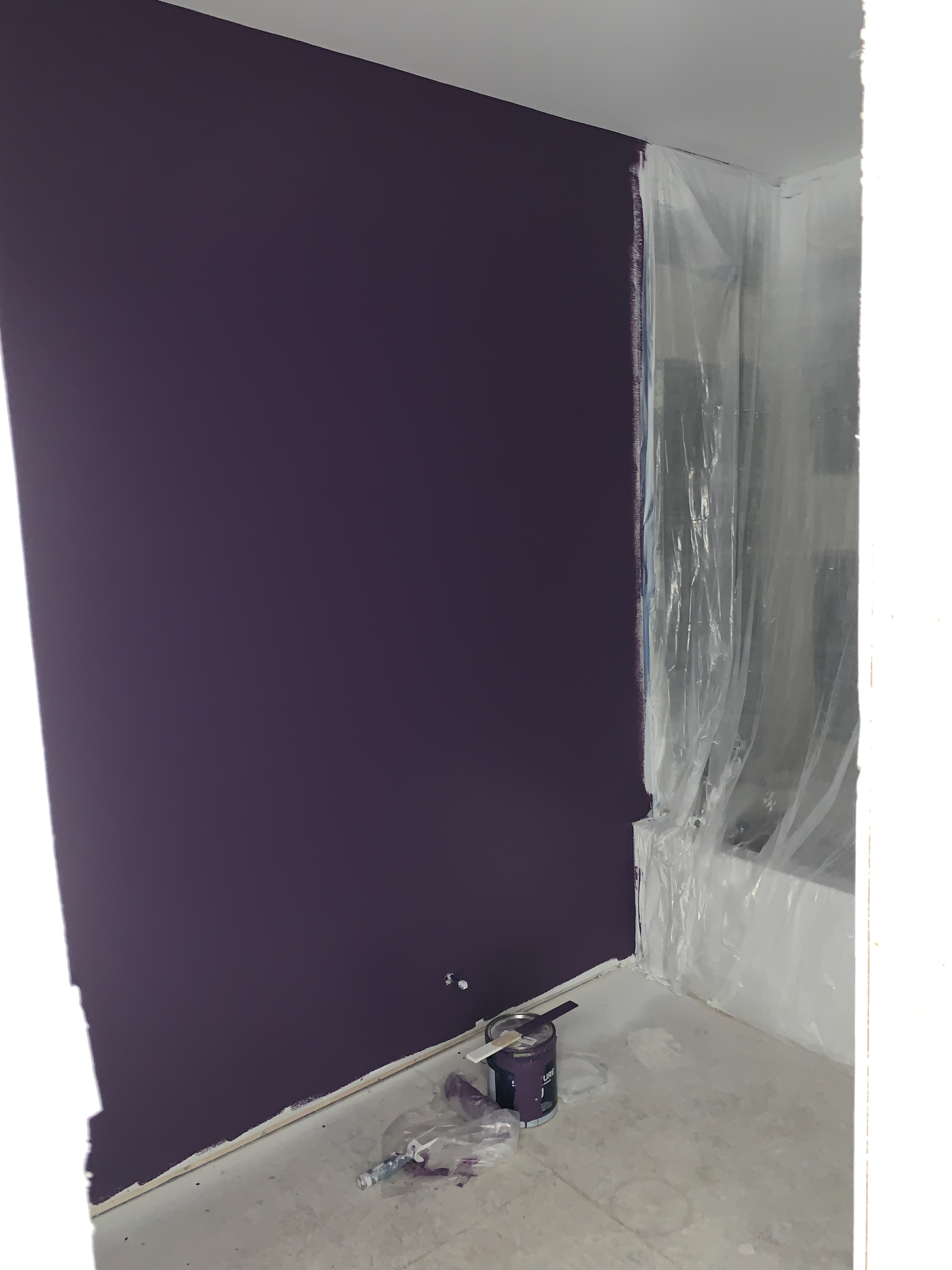
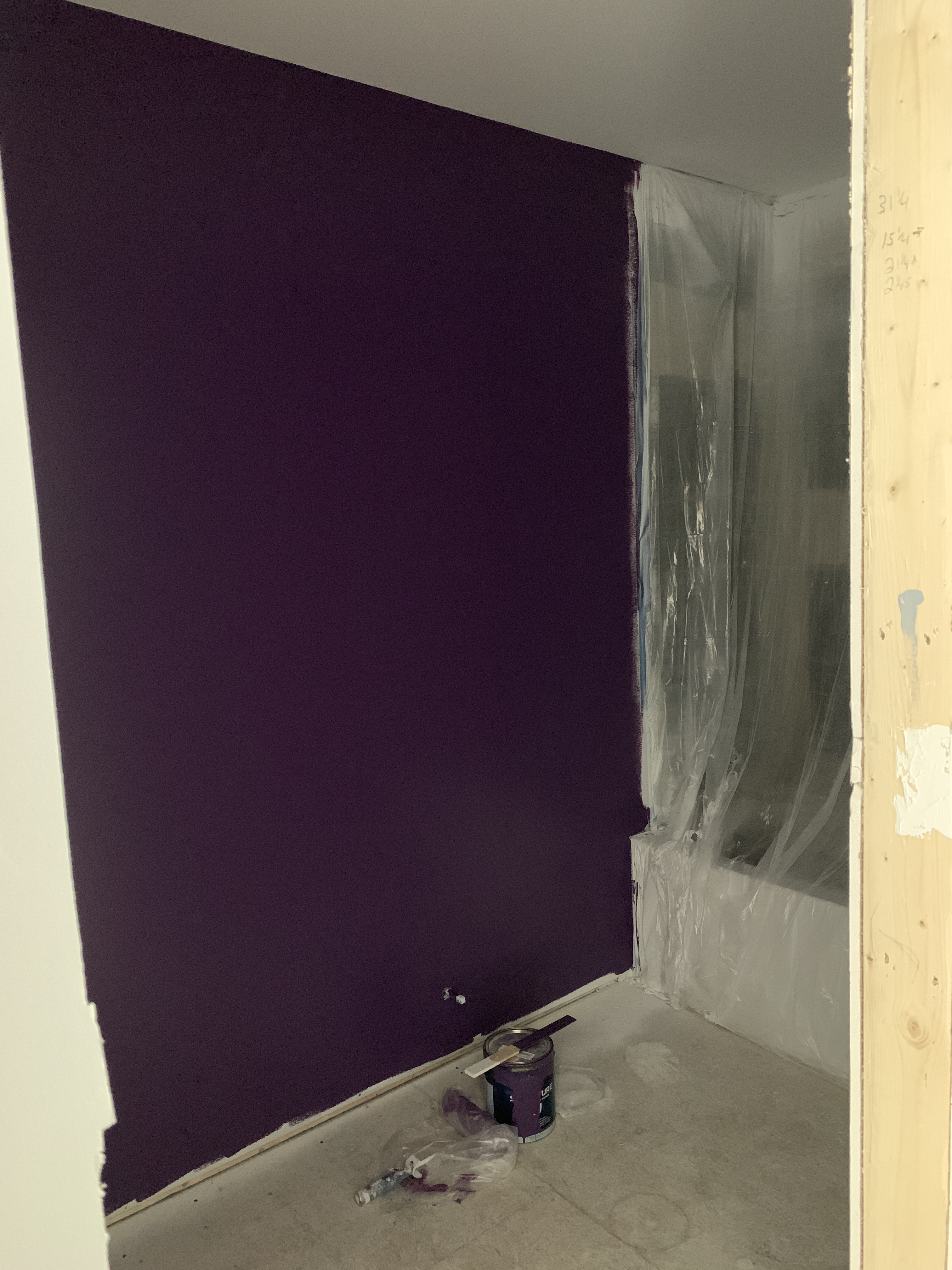
This is actually the color I wanted my office to be in Baltimore, but everyone talked me out of it for resale reasons. And that made sense in a house we didn’t intend to stay in beyond 10 years. So I relented and got a dusty grape that was less dark (and less fun). But this Grimace-adjacent hue is going to be a marvelous little surprise peeking out from the main hallway.
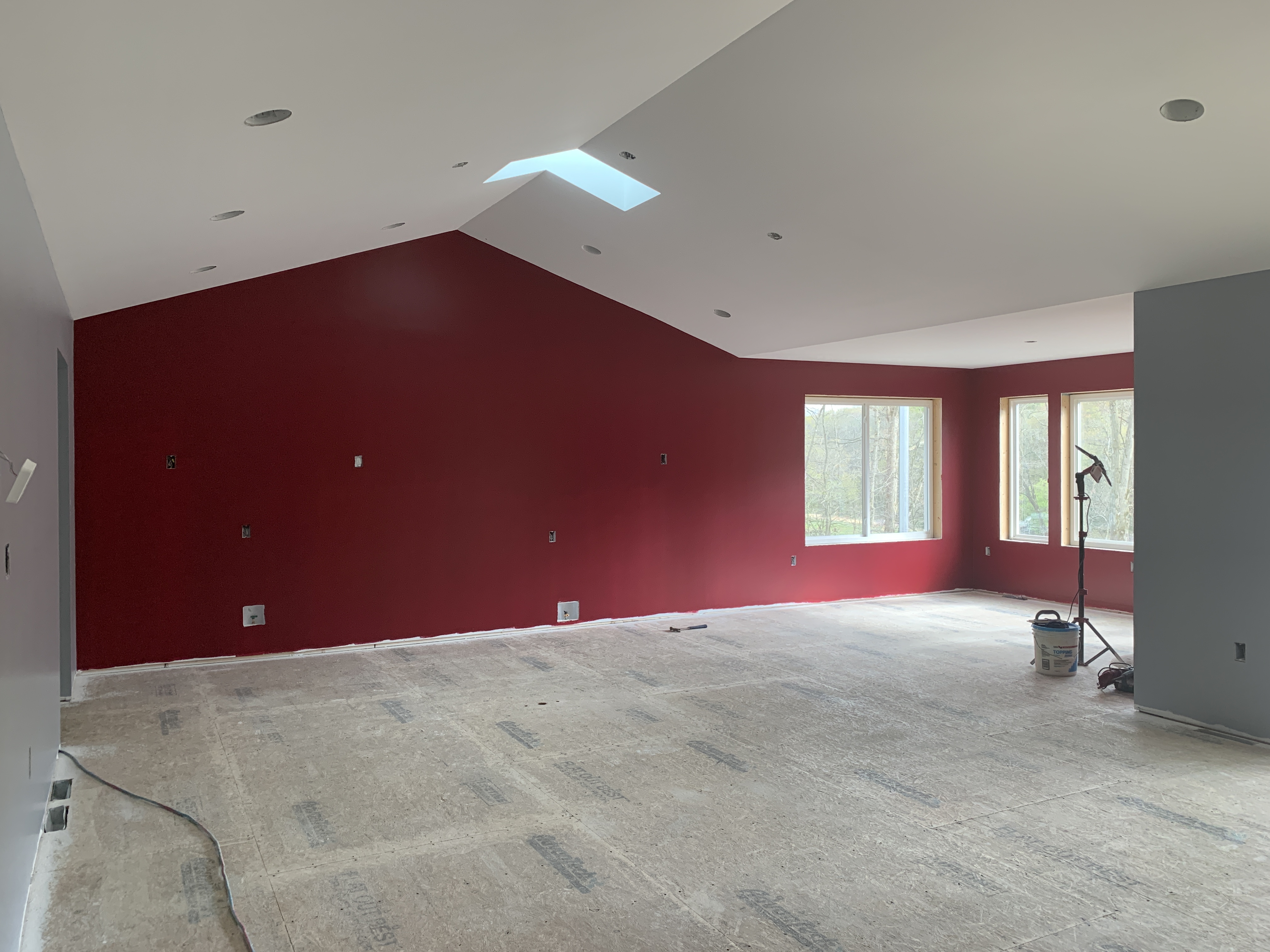
I love a red kitchen SO much, and it was a struggle to find a red that wasn’t too “hot” for our palette. My main rule of thumb when picking colors was to keep them all cool tones so nothing feels too jarring, even when transitioning between very different hues (like we have here with the gray living room walls butting up against the red). This isn’t even as wild as this room will get: We’re getting black cabinets and a glorious black-and-white quartz countertop with lots of lil sparkles in it. Be still my emo heart!
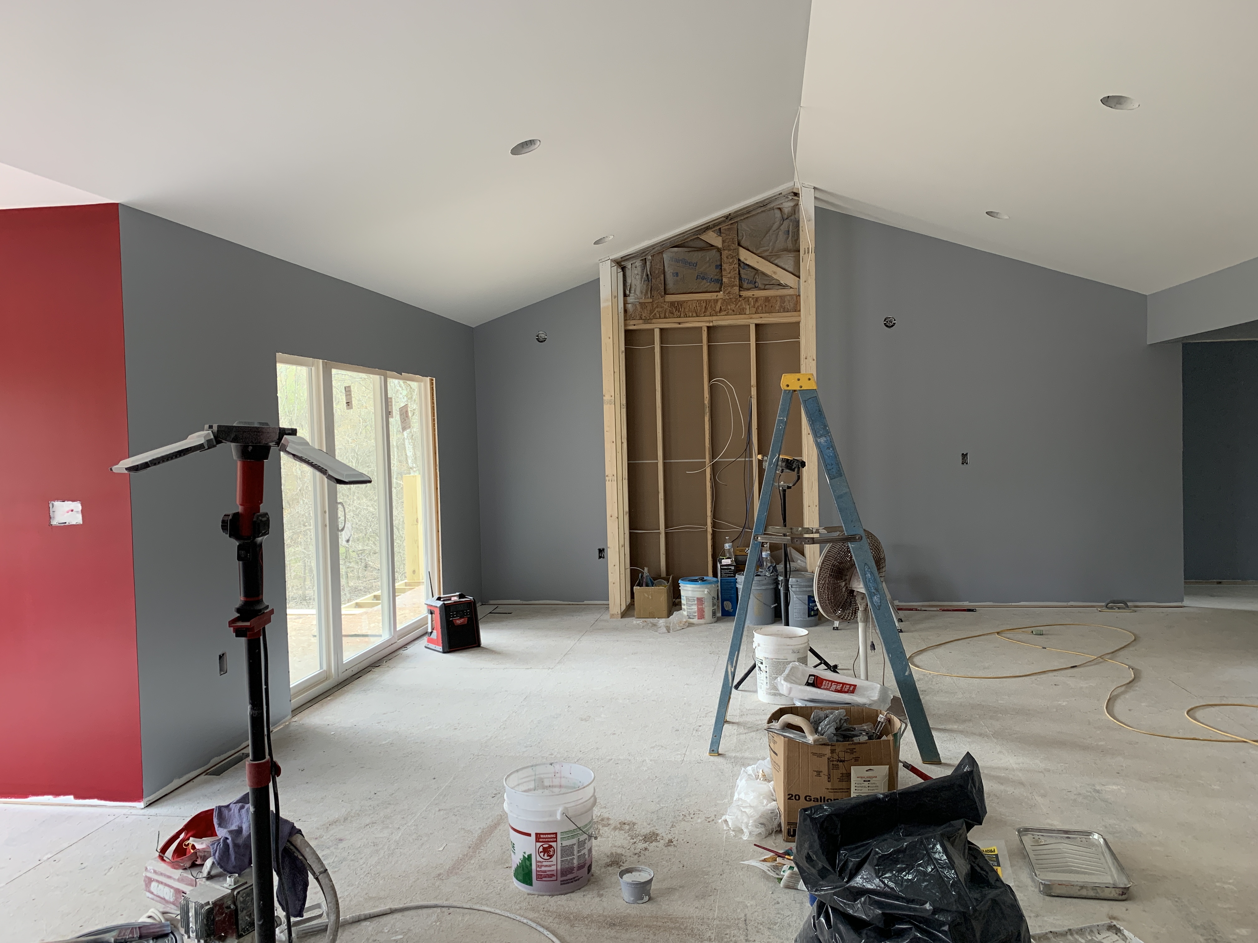
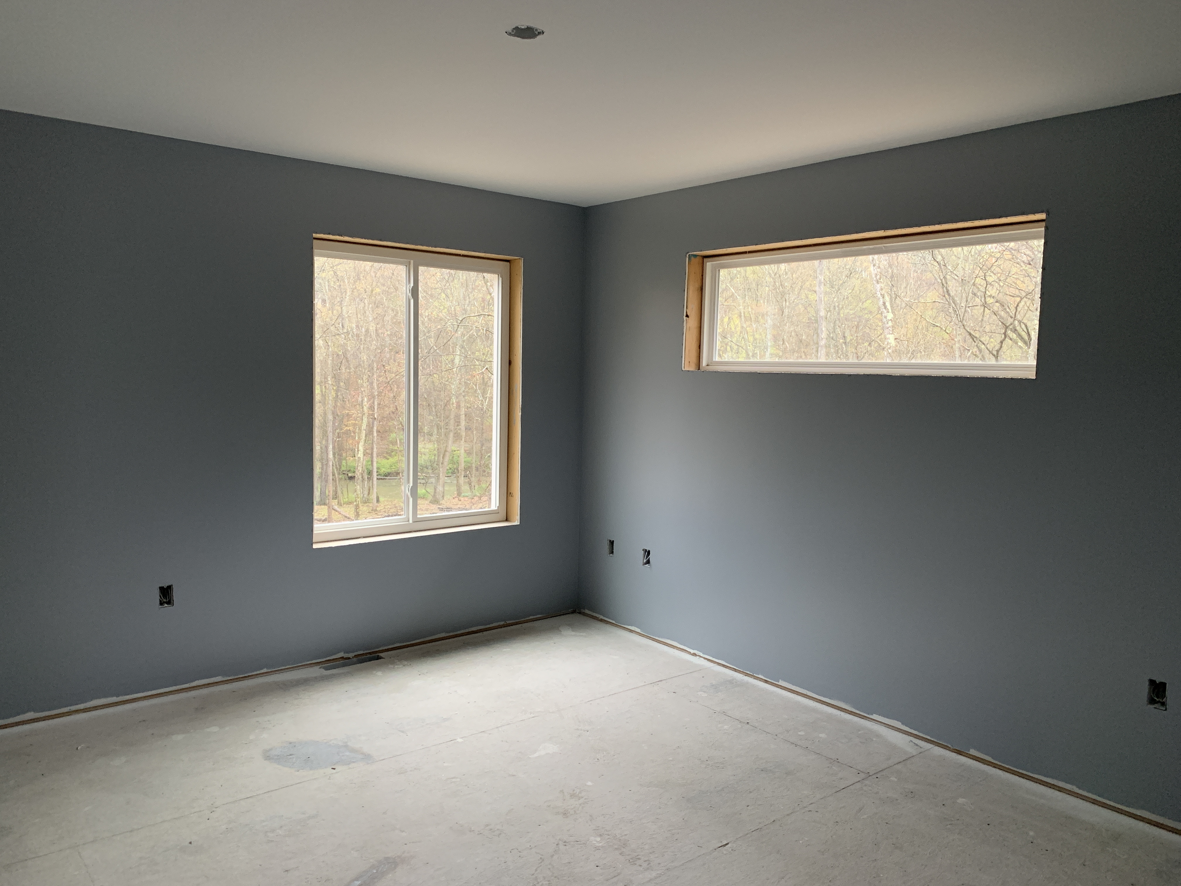
This gray is the color we chose to be our neutral (aka break for your eyes) throughout the rest of the house. We mulled over something lighter, but we have tons of natural light and we need something A) that won’t look washed out in all that light, and B) that’ll create a vivid contrast with the white trim and doors. All the hallways, spare rooms/offices, closets, etc. are gray. White was briefly on the table, but it seemed like a risky choice for a home with two clumsy humans and two absolutely disgusting dogs.
Speaking of our nearly feral furballs: We went with Valspar Signature paint in a satin finish, which is a middle-of-the-road option. It’s more expensive than the basic formula, but it’s supposed to be stain-, scuff-, and fade-resistant. With two dogs roughhousing and shaking slobber all over the place, it’s an investment we’ll (hopefully) be glad we made on a daily basis. Hilo literally shattered one of our outlet plates with his tail in the last house. Nothing is safe.
Apparently, we did something unusual in that we had our builder paint for us. Typically, builders come in and spray everything flat white (see my previous paragraph about our dogs for why this was the worst possible option for us). Then the homeowners roll on whatever they want later. We had a very, VERY brief conversation about painting the walls ourselves whereupon we remembered that we both hate painting with the fire of a thousand suns. We actually needed a multi-year break between painting rooms in our last house.
So we opted to spend extra to have the builder paint for us. We kept it simple and only went with four colors total, which I’m telling myself kept the cost down a little. But the thought of cutting in and rolling paint across nearly 2,500 square feet that include a cathedral living room-kitchen ceiling, a 16′ office ceiling, and a two-story stairwell… that’s a hard pass. Did I mention the kitchen and dining room required a THIRD coat? Triple nope.

Everything looks awesome! Love the bold colors!
LikeLike
Thank you!
LikeLike